Artemis: A Design System Built for the Match
Veo’s web product had two component libraries drifting apart and no design lead. I took ownership and, working with AI, shipped a complete design system in under two weeks.

An animated sample of Artemis components in four tiles: a player avatar that gets a captain mark, a football line-up, rows of tags, and a Save button going through its states.
- <2weeks, first decision to coded system
- 57component pages, 1,161 variants
- 279decisions logged, each with a reason
- 30kFigma layers moved by script
The pace
Under two weeks, because AI did the clicking
I made every design decision and wrote it down. Claude carried each one out across the whole Figma file and into code.
First days
Foundations
I decided
- Figma is the single source of truth
- Two typefaces, three weights, two control sizes
AI carried out
- 1,913 icon instances fixed
Week one
Components
I decided
- One Appearance axis for buttons
- Selected is black or white, never green
AI carried out
- 1,000 → 60 Button variants
- 640 → ~96 Badge and Tag variants
Week two
Tokens
I decided
- Colour names say the purpose, not the hue
- Two neutrals, one size scale
AI carried out
- 165 → 104 semantic colours
- ~4,500 layers re-pointed by rule
End of week two
Code and handover
I decided
- One export for engineers and AI tools
- Token names frozen
AI carried out
- ~30k layers moved to the final tokens
- 57 pages of coded reference site
279 decisions logged, each with its reason. The log is the handover for engineering.
The situation
Two libraries, drifting apart
An old in-house library still ran most of the product, in 590+ files. A newer one on Web Awesome was meant to replace it, and Figma lagged behind both. I chose Web Awesome over shadcn or building our own, then cut it down to what Veo uses.
1,00060Button variants
One Appearance axis, two sizes.
640~96Badge and Tag variants
Two components became one Tag.
165104semantic colours
Named by purpose, light and dark.
1,000 Button variants in the kit I started from. The 60 in green are what Artemis ships.
The system
The system, on one page
Real token values, rebuilt to match the library exactly.
01 · Typography
Words and numbers get different faces
Protokoll for words, Oldschool Grotesk for numbers. One weight per role.
20 text styles
- Display56 / 60 · BoldSunset Falcons
- Hero48 / 52 · Bold2 – 1
- Stat40 / 44 · Bold27.6 km/h
- Numeral24 / 28 · Bold87%
- Digit20 / 24 · Bold10
- H128 / 36 · BoldTeam default line-up
- H224 / 32 · BoldPlayer moments
- H322 / 28 · BoldMake Andre captain?
- H420 / 28 · BoldMatch events
- H518 / 24 · BoldAndre Valdez
- H616 / 20 · BoldRecording in progress
- Label14 / 20 · BoldSave line-up
- Body14 / 20 · RegularCreate a starting line-up that loads for every match.
- Strong14 / 20 · MediumHighlights are ready.
- Caption12 / 16 · MediumSunset Falcons · CM
- Overline12 / 16 · MediumBuilding blocks
02 · Colour
Two neutrals, and green means focus
Beige for light surfaces, a green-tinted gray for dark. Green is kept for focus and the brand.
107 semantic colours, light and dark
GreenBrand, focus and success
- 95
- 90
- 80
- 70
- 60
- 50
- 40
- 30
- 20
- 10
BeigeLight surfaces and text
- 98
- 95
- 90
- 80
- 70
- 60
- 50
- 40
- 30
- 20
- 10
- 08
GrayDark surfaces, tinted green
- 95
- 90
- 80
- 70
- 60
- 50
- 40
- 30
- 20
- 15
- 10
- 08
- 05
SignalsDanger, warning, info and AI
Semantic variablesOne name, one value per mode
| Variable | Light | Dark |
|---|---|---|
Surface/Page | Beige/98 | Gray/05 |
Surface/Section | White | Gray/08 |
Surface/Card | White | Gray/10 |
Surface/Neutral/Solid/Default | Beige/08 | Gray/95 |
Surface/Brand/Solid/Default | Green/30 | Green/50 |
Content/Neutral/Primary | Beige/08 | Gray/95 |
Content/Neutral/Secondary | Beige/40 | Gray/70 |
Border/Section | Beige/90 | Gray/15 |
Effect/Focus Ring | Green/40 | Green/60 |
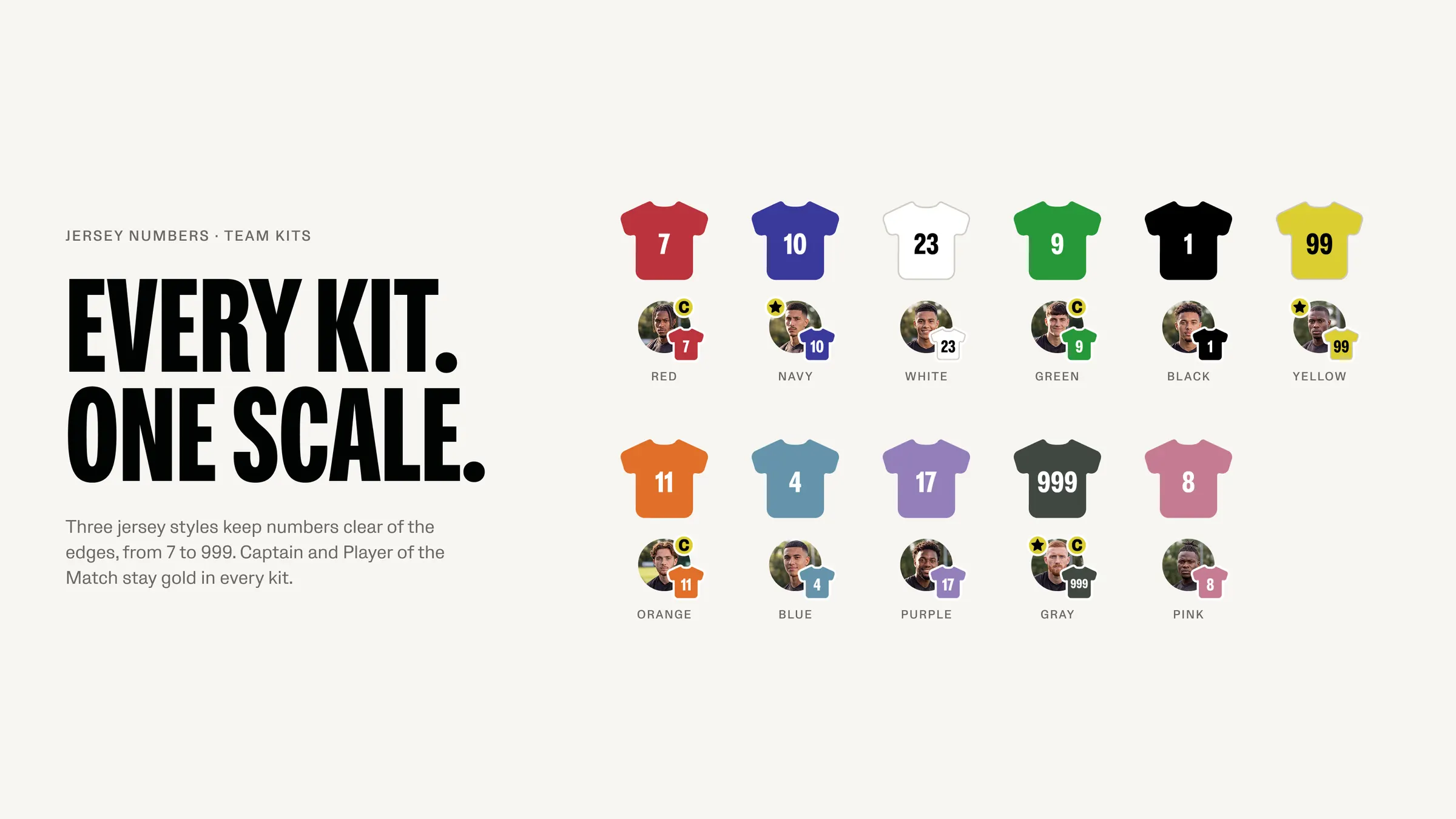
Team kits11 kits, one jersey
03 · Components
A few of them, light and dark
Two sizes on one size scale. The rest, with every property, is in the playground below.
57 component pages, 1,161 variants
Light
ButtonSolid · Outline · Plain · Inline · Danger
SizesRegular 40 · Condensed 32
ControlsThey work: try them
TagSix colours, and filters that toggle
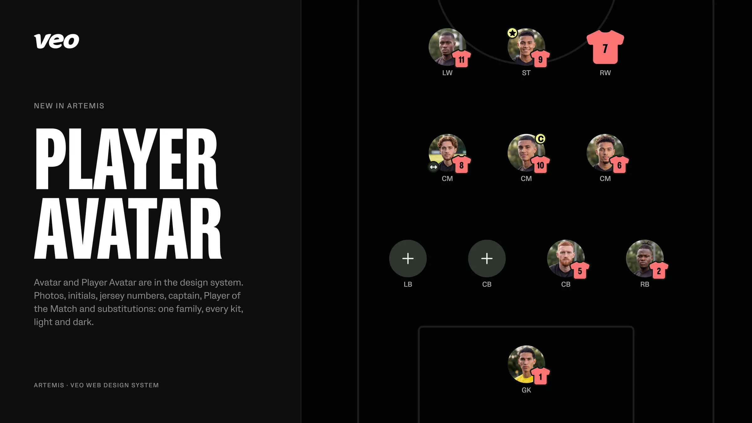
Player AvatarPhoto · Initials · Jersey · Open spot · marks
ToastInverted in both modes
Dark
ButtonSolid · Outline · Plain · Inline · Danger
SizesRegular 40 · Condensed 32
ControlsThey work: try them
TagSix colours, and filters that toggle
Player AvatarPhoto · Initials · Jersey · Open spot · marks
ToastInverted in both modes
Playground
Try the real components
Every control is a property of the Figma component. The line under the preview names the Figma variant.
InteractivePick a component, change its properties, or click the component itself.
A player in a team: the jersey number in the team kit, marks for captain, Player of the Match and substitution, an optional position label, and the open spot of a line-up.
Figma variantCompleted=True, Content=Avatar, Digits=1-2, Size=48, State=Default
Properties
State
Rebuilt for this portfolio and checked against the library. Veo’s source stays with Veo.
One source, many readers
From Figma to engineers and AI tools
One export turns Figma into tokens, a coded reference site and a guide. The same guide is packaged for AI coding tools, so they use the system instead of inventing buttons.
- FigmaVariables, styles, components
- TokensEvery colour, size and type value, light and dark
- Reference siteEvery component and property, in code
- Guide and agent packWhat to use when, for engineers and AI tools
Bringing people along
Short updates people actually read
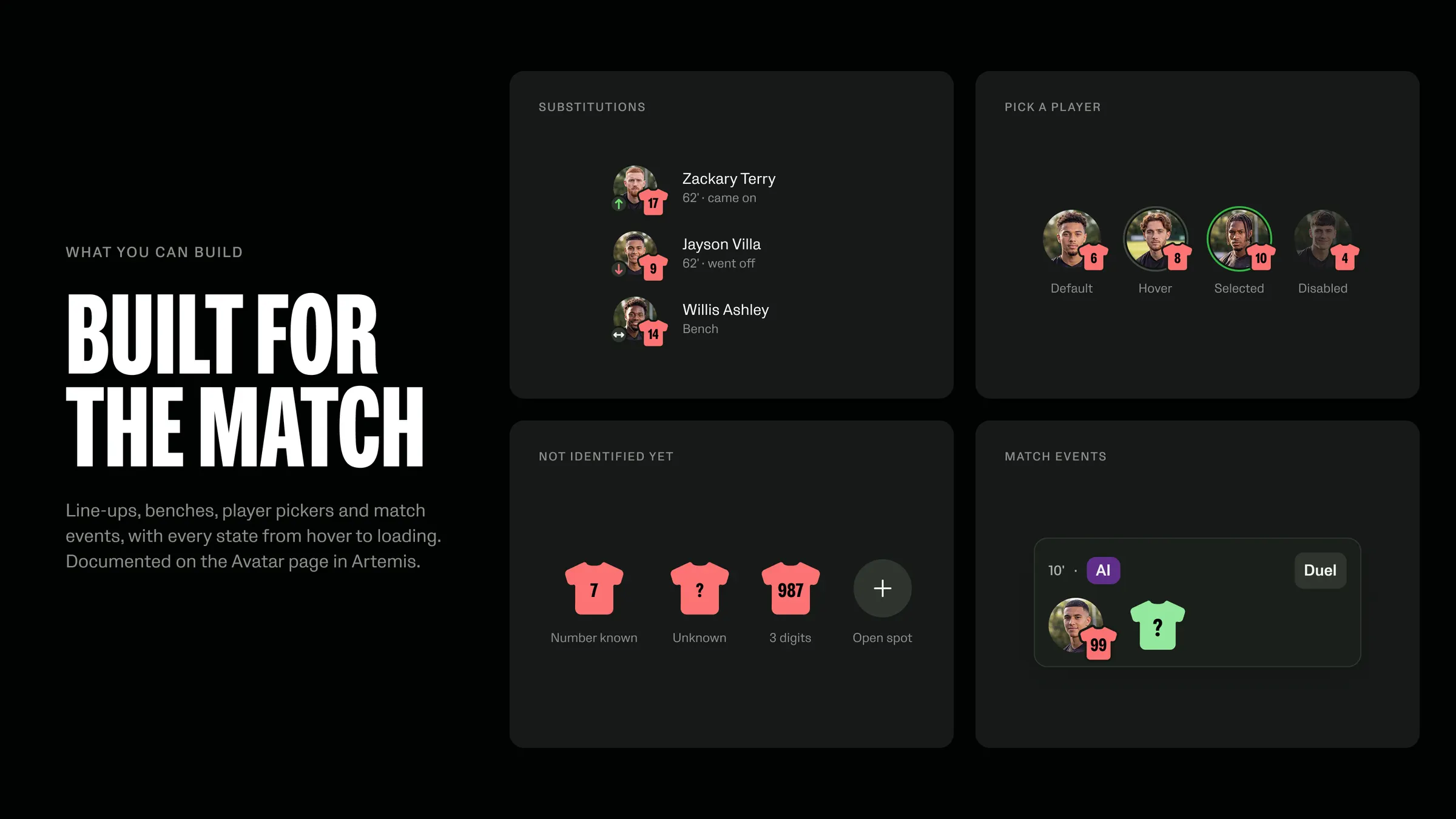
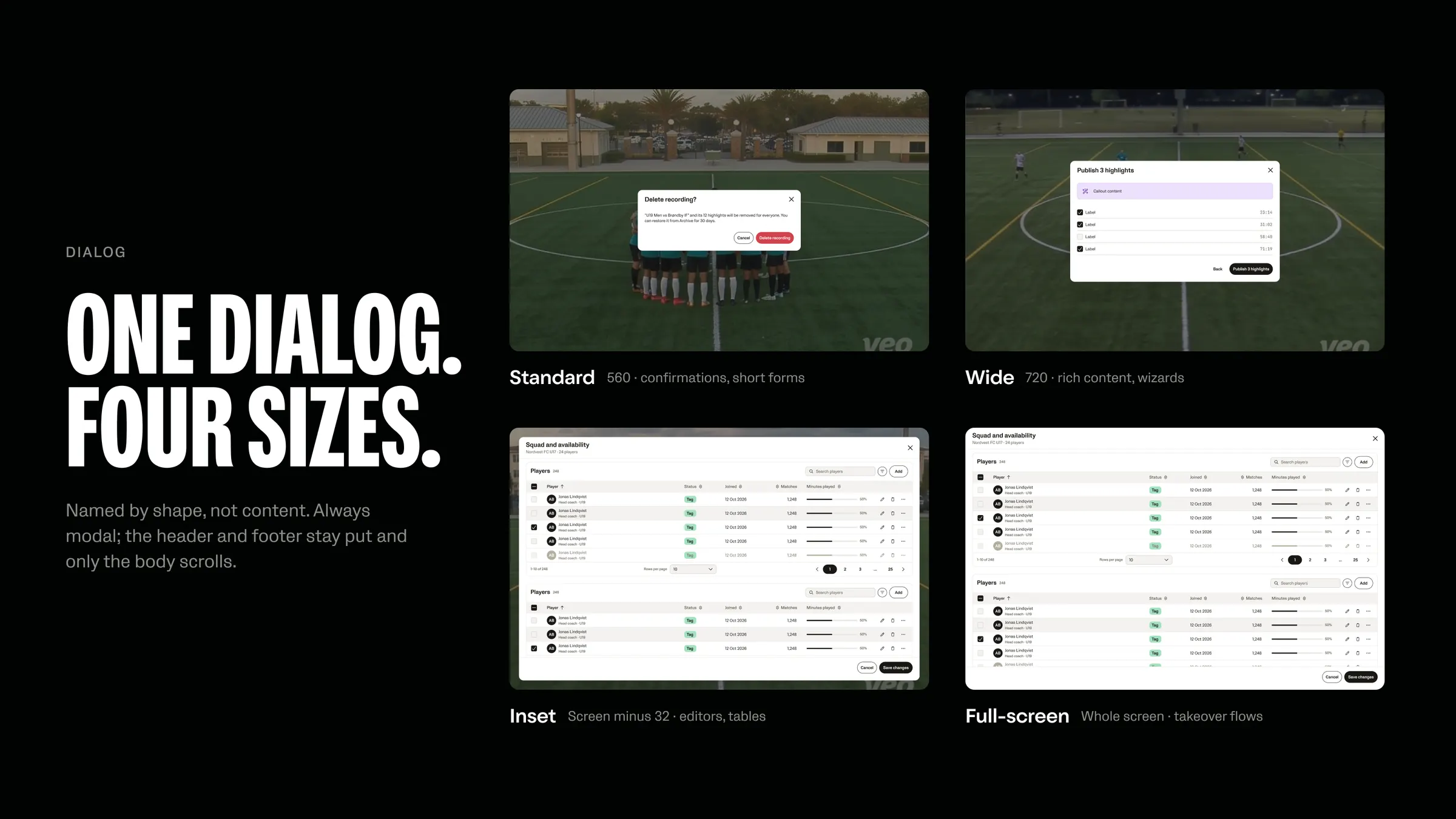
After the core shipped I kept adding Veo’s own components and shared short visual updates: one idea per slide.
Contribution
Everyone can contribute, nobody goes rogue
I proposed a design system guild: shared ownership, one vocabulary, one path for every contribution. Off-pattern work is agreed at library level, not inside one task.
- Proposal
- Designing
- Review
- Ready
- Deprecated
Looking back
AI made it fast. The decisions made it a system.
AI made it fast because every decision was small, written down and mine.
The honest gap: the contribution model is proposed, not yet lived. Following it through with the teams is next.
Thanks for reading!